
Project Overview
The client's emphasis on time constraints and application functionalities was pivotal in securing the project, with the organization's commitment to delivering within a tight timeframe being the decisive factor. Developing a mobile application with multi-lingual, multi-platform, and multi-persona support in just eight months presented significant challenges. Conducting thorough research on a limited budget added to the complexity.
While customer experience remains paramount, this project uniquely focused on fostering synergy between business, customers, and the Agile team, harmonizing Agile, Scrum, and UX Design practices.
Named aptly, the AR Color Visualiser aimed to enhance spaces using Dulux paints' color palette through Augmented Reality, posing a demanding task that required intensive research within a limited timeframe.
The application, designed for both B2B and B2C markets across Android and iOS platforms, demanded compatibility for over 20 global markets, necessitating the incorporation of multilingual features.
Efficient collaboration with internal teams proved instrumental in easing the design phase's challenges.
Key Points
-
Design a Mobile application for visualising space in AR with Dulux paints.
-
Android & iOS
-
B2B & B2C variants
-
20+ Markets Worldwide
-
Integrate Nix Device for accurate measurements.
Design Brief
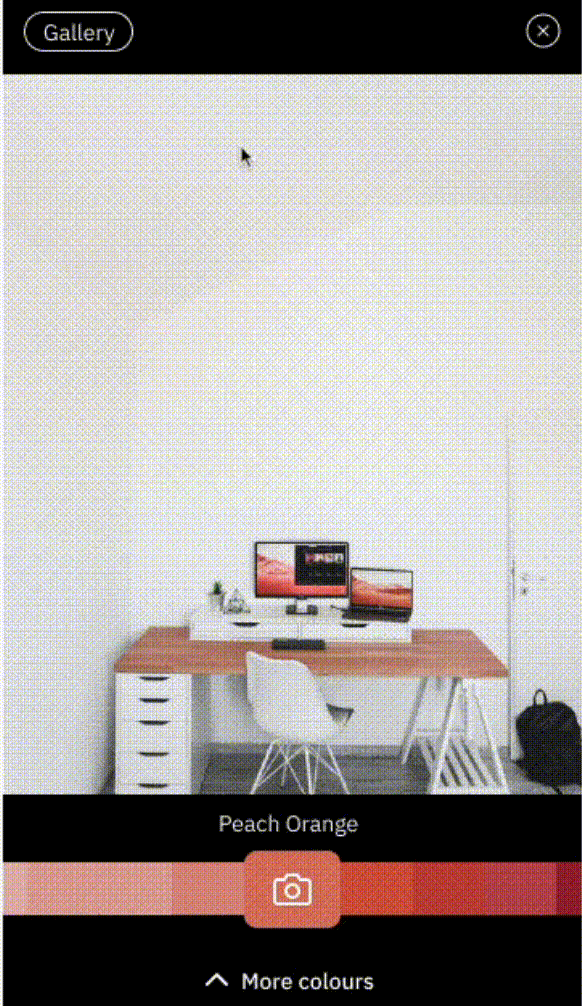
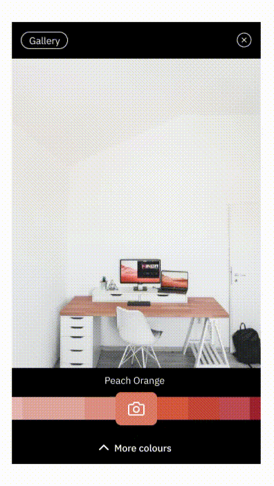
Visualiser application is a platform where users can visualise colours for their space using AR technology from their mobile devices.
-
See paint colours appear instantly on walls using Augmented Reality.
-
Pick and save inspirational colours from the world around you to try in your home.
-
Explore the full range of products and the colours of the company.
Requirement
Completely redesign a mobile application that helps the user to visualise their space using company colours
along with the redesigning, they need to integrate new features as well.
-
There will be a business variant as well.
-
A tangible device feature integration for accuracy.
-
Multicolour collection within the company database should be compatible with the new design.
B2C Visualiser
Any potential customers who want to visualise their space before painting.
-
See paint colours appear instantly on walls using Augmented Reality.
-
Pick and save inspirational colours from the world around you to try in your home.
-
Explore the full range of products and the colours from the company.
-
Save their colours & products in personalised spaces
B2B Expert
Specific professionals who help in visualising their space and estimating the paint
-
See paint colours appear instantly on walls using Augmented Reality.
-
Pick accurate and save inspirational colours from the world around you using a tangible device.
-
Explore the full range of products and colours from the company.
-
Save their colours and products in personalised spaces, create notes, slideshows
Roles & Responsibility

Questions & Assumptions
As part of the data collection in the project discovery phase, Business Analyst and the Design Lead had conducted qualitative as well as quantitative studies at the client locations. One to one meetings and workshops helped in clarifying the assumptions and queries. This mobile application mainly focuses on two personas - normal users and expert users. Normal users are the consumers whereas expert users are Interior Designers and paint Experts. Since these categories are not active participants in the Paint consumption stories in our country, there arose the need to gather information from those personnels at client locations.
Persona
Normal users and Expert users are the two main personas studied here based on which two different versions of the app is created to cater the needs of both. Below are the two app versions.
Qualitative
Direct interaction with the expert users was pertinent as they are the ones who exclusively deal with paints and they are lesser in number compared to the normal users such as consumers or app explorers. Hence, a qualitative analysis is required for this persona. Interviews were conducted to collect information from these expert users.
Visual ethnographic studies were done on these expert users by understanding their conventions and client interactions.
Quantitative
Basic demographic surveys were conducted on a wide range of normal users wherein the data regarding their age, gender and other general features are retrieved.
A generic questionnaire was prepared to understand the usage and application of colours in this group of users.
Affinity Mapping
The data collected from qualitative and quantitative research was plotted through affinity mapping. By using this mapping method, ideas were grouped and clustered into categories relevant to each theme. The patterns that emerged were noted and helped in making the app feature-rich.

Priority Matrix
Although numerous features were identified to be included in the app, the major challenge was to identify the features to be focused on primarily in the first release. Since the time was very limited, the most acceptable approach was to concentrate on the focus points. Evaluation and creation cannot happen at the same time in our brains. Hence we created the ideas or features first and then tried to evaluate them using a priority matrix.


User flow
A side-by-side comparison of the user flow in both apps was done to identify the similarities and differences in both cases. Similarities represented were common traits which could easily be achieved using common functionalities and hence a lot of time was saved in this regard. However, dissimilarities were obviously considered separately as the functionalities were different. As shown in the user flow diagram, similar functionalities are represented in the same colour whereas dissimilar items are in an alternate colour.

User Stories
From the above processes, user stories were defined and developed further and added the acceptance criteria as well.
Visualiser exclusive stories
-
Shopping cart
-
Idea Based
-
Inspirations Mood boards
-
AR single colour collection interface
Expert exclusive stories
-
Advanced paint calculator
-
Nix Device
-
Hue bar
-
Project-based
-
Tips and Supports
-
AR Multi colour collection interface
Common Stories
-
Product to Colour Journey
-
Colour to Product journey
-
Locate store map
-
Search feature
-
Camera-based colour picker
-
Basic Paint calculator
-
AR Screens
Area of Focus
-
Integrating tangible device for accurate colour picking.
-
Integrating the multicolour collection into the mobile UI.
-
Create masking feature for detailed visualisation.
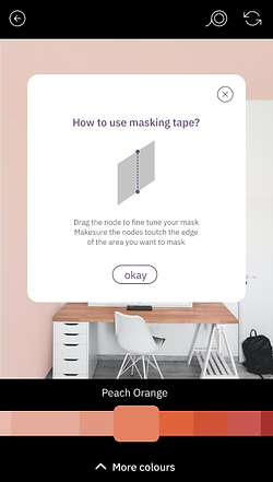
Masking
Problem
-
There are times where the system cannot distinguish between surfaces and boundaries, Colours can bleed through the boundaries while visualising a surface.
-
Masking is a feature that can create precise control on the flow of colours over surfaces.


How to Mask
To begin masking user needs to at least apply some colour to the surface. Once the user clicks the masking button masking mode will be enabled.
Users can specify the starting and finishing nodes of a mask and they are also able to drag and change the position of the nodes.
Once the masking node cuts the very end of an applied colour surface minor segment will be discarded thereby showing only the required position.
Masking Back and Forth
There are situations where the user are not quite done with the masking but anyhow they decided to move forward with the mask they have applied but then they noticed that it is not quite done yet so they design back to masking mode where they can edit their masking node this feature allows the user to always come back to the masking mood and can see the mask they have applied previously and they can edit.
Clear Masking
Due to the technical Limitation Masking log is not available so 1 by one deletion is not possible, clear masking button clears all the masks at a time.
Once clear masking is applied masking feature will be revoked and The Colours will spread across as per the prior state before masking


Mask Limit
Since there are multiple masking involved there should be a limit. Since more masking can create a chaotic spacing, the number of the mask has been limited to 10

Info Button
Since there is a learning curve in masking , Tool tips will be shown while logging for the first time, and then info button will be added for reference at any point of time.


Colour Picker Device Integration
Tangible devices
Specific professionals who help in visualising their space and estimating the paint
For expert users instead of the colour picker feature, a tangible device can be used to pick a colour with great accuracy and near similar colours can from the company be recommended

Multi Colour Collection Integration
There are a lot of colours involved which need to be grouped,
the challenge was to create the mobile UI for all colour variations which should be compatible with UI.

Multicolour Collection Universal UI Templates
There are a lot of colours involved which need to be grouped,
the challenge was to create the mobile UI for all colour variations which should be compatible with UI

Colour Collection Transition
There are a lot of colours involved which need to be grouped,
the challenge was to create the mobile UI for all colour variations which should be compatible with UI
UAT
It is imperative to perform UAT after investing both time and resources in a digital product to ensure the desired outcome can be achieved. An effective UAT was inevitable here as well. In order to ensure the asset branding consistency and compatibility of the functionalities in both Android and IOS platforms, multiple UAT was conducted which came out well in the final product.
App Released
Android Play store
Visualiser
https://play.google.com/store/apps/details?id=com.akzonobel.uk.dulux&gl=GB
Expert
https://play.google.com/store/apps/details?id=com.akzonobel.pro.uk.dulux&gl=GB
iOS App Store
Visualiser
https://apps.apple.com/gb/app/dulux-visualizer/id404007106
Expert
https://apps.apple.com/gb/app/dulux-trade-paint-expert/id589781650